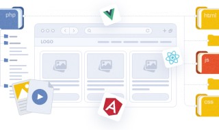
Make your website responsive to keep it on the top of the competition & increase your conversion rates. You will notice many advantages of the responsive design. Not only you will stay in sync with the latest trends, but reach a larger target audience. Today there is a great variety of screen sizes. People can choose from smartphones and tablets to Google Glass and etc. There are no required standards as to size of the screen. That’s why Webxloo create responsive designs that can adjust to a vast variety of screens.
We provide our customers with the best services and care about their performance among competitors. Try to read current article on a desktop, laptop, or mobile device. Turn the devices to landscape/portrait mode and observe how the design adapts to the screen size and resolution. It’s too much easier to enjoy the information when your screen is adaptive. With a mobile design you can read, navigate and interact with a website on the device of your choice without having to zoom in or out.

Without a mobile-friendly website your online future is bleak. If you’re not providing a mobile-friendly experience for your customers, they’ll bounce off your website and go to your competitor whose website is easier to use. People increasingly favoring their mobile devices over desktop computers. The future belongs to mobile.
Contact us now and optimize your website. Find this article interesting? Share it.
Last updated on January 21st, 2020
More Tips For Website Improvement
2024
20Dec
Building a Mobile-Friendly Website: Why It Matters and How to Do It
In today's mobile-first world, consumers are glued to their smartphones and tablets. Gone are the days when websites were primarily accessed through desktop computers. This shift in user behavior demands a crucial website feature: mobile-friendliness. A website that…
2024
11Oct
Beyond the Fold: Website Design Trends to Watch in 2024
The digital landscape is constantly evolving, and website design trends are no exception. In 2024, user experience (UX) remains paramount, with a focus on functionality, intuitiveness, and visual appeal. This article explores the top website design trends that will…

2024
19Jan
A Voyage Through the Ever-Shifting Tides: Webxloo and its Role in Web Evolution
The World Wide Web, once a developing frontier, has transformed into a boundless ocean, teeming with websites of every imaginable shape and purpose. In this dynamic landscape, few have navigated the evolving currents with the agility and insight of Webxloo. Our…


